A year of CB App, and now it fits in a pocket
CB App is one HTML file with no server, no account and no network — a scratchpad that keeps everything on the machine it is open on. A year and a few dozen releases later it finally works on a phone and a tablet, without giving up the thing that made it worth using.
CB App is the least glamorous thing I have ever built and easily the one I use the most. It is a single HTML file. You open it, and you get a desk: notes, task lists, sticky notes, a calculator, a clock, a log, a calendar. Nothing installs. Nothing signs in. Nothing phones home.
It exists because I wanted a scratchpad that stayed put. Somewhere to keep a half-finished thought, a list of what I had already tried, the exact wording of something I would need again in ten minutes — without that text becoming a row in somebody else's database, and without installing anything to get it. Most notes apps answer that with an account and a sync service. I wanted the opposite: a file.
So: one file, on disk, opened directly in whatever browser is in front of me. That constraint has shaped every decision since, and a year in it is still the best thing about the app.
Where it started
This is the oldest screenshot I still have. Blue buttons, a stack of windows you could drag around, and the T2 template — a ten-line form I filled in over and over.
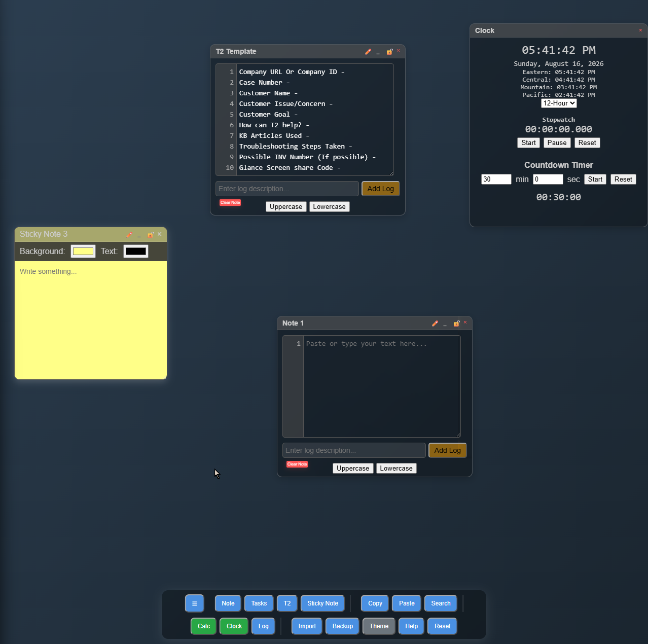
It was rough in ways I did not notice until other people started using it. Every new window opened in the same spot, so three of them were one pile. The button that downloaded a copy of the app produced a copy that did not work. Status messages rendered underneath the toolbar, which is a fun way to say that error messages were invisible. The calculator got 2+3*4 wrong — it answered 20, because it did the sum left to right and never learned that multiplication goes first.
None of that is exotic. It is what a tool looks like when it has exactly one user who already knows where the sharp edges are.
What a year of releases actually bought
There have been a lot of releases since — most of them small, a handful of them not. Rather than list version numbers, here is what actually changed, in the order it mattered to me.
Things stopped disappearing. Windows cascade instead of stacking. A session saved on a big monitor comes back intact on a small one instead of scattering its windows off the edge of the screen. Minimising a window puts a chip in the corner you can click, rather than filing it somewhere you have to already know about. The "download a copy" button now writes a clean, working file with your work embedded in it, which is what it always claimed to do.
It got a lock. You can put a passphrase on the session, and everything is encrypted where it sits. There is also a lock button in the corner for stepping away from the desk: one click seals the session, clears the screen and refuses to save anything until you come back and unlock it. For an app whose whole selling point is that your notes stay on your machine, this was the missing half.
It got usable by people who are not me. The whole app was audited for contrast and keyboard access, and the results were embarrassing in the specific way that audits are: title-bar buttons only a few pixels wide, an unlabelled dropdown, a panel you could read with a mouse but not reach with a keyboard, and a "selected" highlight that was legible only if you already knew where it was. All fixed, and now checked automatically on every release so they cannot creep back.
It grew a calendar and a much better calculator. The calendar does events, repeats and reminders, and lives inside the same encrypted session as everything else — the calendar it replaced kept its events in the clear, off to one side where the encryption never reached them, which is most of why it was rebuilt rather than restored. The calculator became five calculators behind a dropdown: ordinary arithmetic, a time card that adds up shifts, energy cost, Ohm's law, and liquid volume conversions. That sounds like feature creep and mostly is, except that every one of them replaced a thing I was doing in my head and occasionally getting wrong.
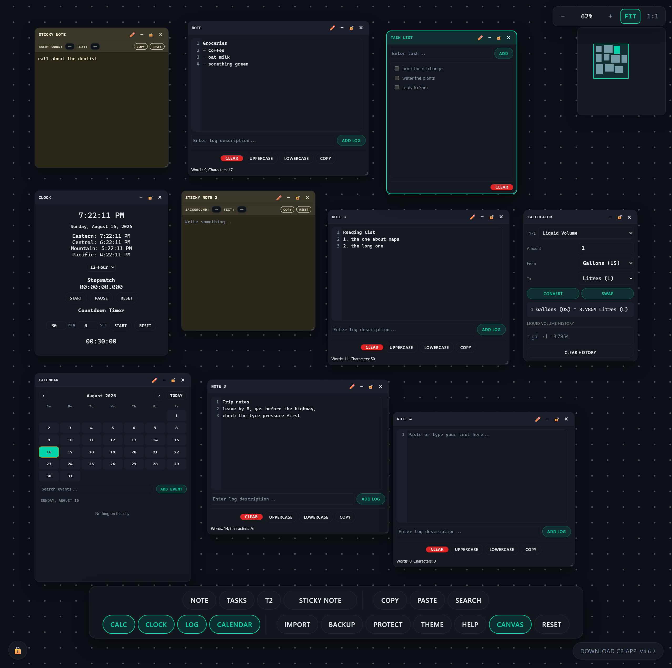
It got a bigger desk. There is a second mode — a canvas several times the size of your screen that you pan and zoom around, with a minimap in the corner so you can find what you left where. It is for the days when eight windows is not enough, and it is what the screenshot at the top of this post is showing.
The thing it never did
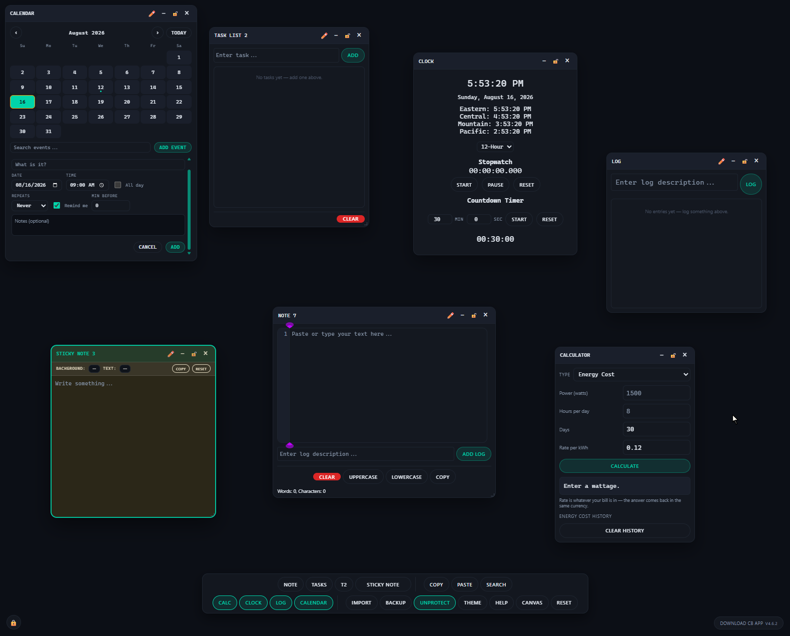
For all of that, CB App only ever worked in one place: a wide screen, with a mouse. That was fine, because that is where I used it. But it meant the app had exactly one home — a desk with a big monitor on it — and it was useless the moment I stepped away from that desk.
Opened on a phone, it technically loaded and practically did not. The toolbar's twenty buttons wrapped into four rows and ate a quarter of the screen. The windows underneath were wider than the display, so their own close and minimise buttons sat past the right edge with no way to reach them.
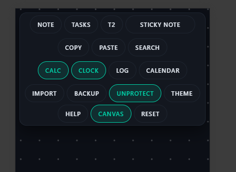
And a tablet — or a browser window snapped to half a screen — landed in a no-man's-land between the two, where the toolbar would drift off the side of the screen with a whole group of buttons unreachable behind it.
v4.6: two shapes, not four
The fix was not to make the app "responsive" in the usual sense of everything gently shrinking. It was to decide that CB App has exactly two shapes and that every screen gets one of them.
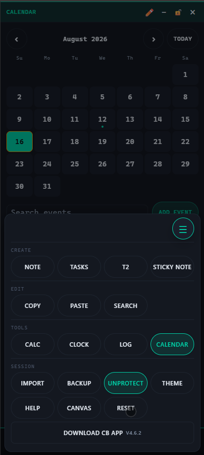
On a phone, the toolbar collapses to a single button in the bottom corner, within reach of a thumb. Tap it and it opens as a labelled sheet — Create, Edit, Tools, Session — which is clearer than the desktop's rows of pills, where those groups are only implied by the dividers between them. Windows fill the screen instead of floating, and a strip of tabs along the top switches between them, because full-screen windows cover each other completely and you need some way to say "the other one".
On a tablet, you get the desktop shape — draggable windows, toolbar along the bottom — because a tablet has the room for it, and taking away free-floating windows from someone who has the space for them is a downgrade dressed up as a feature. What the tablet does get is everything sized for a finger rather than a mouse pointer: bigger buttons, bigger calendar cells, and pinch-to-zoom on the canvas that zooms the canvas instead of the whole page.
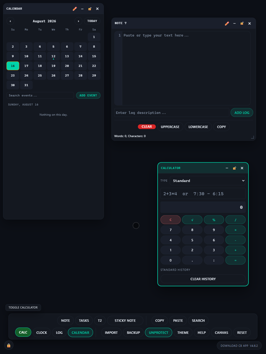
Which shape you get is one decision, made once, from the width of the screen and whether you are using a finger or a mouse. The bugs that made this release worth writing about were all cases where the app had quietly grown a third and fourth answer to that question — a half-desktop, half-phone layout that nobody designed and that only showed up at particular window widths.
The last few point releases were the kind of thing you can only find on real hardware: on an iPhone, the top of the app was drawn underneath the system clock and the battery icon; on an iPad, pinching to zoom the canvas zoomed the entire page instead. Both are invisible to every emulator I have. Both were reported by someone holding the actual device.
None of this cost any privacy
This is the part I care about most, so I want to be plain about it.
The phone version is the same single file as the desktop version. Not a companion app, not a web service with a mobile skin — the same file, doing the same thing, which is nothing at all over the network. There is no account. There is no sync. Your notes are in the browser on the device in front of you and nowhere else, and if you want a copy somewhere else you get it the same way you always did: press the download button and you have a file.
The reason it works on a phone is that it never needed a server to work on a desktop.
You can save it to a home screen and it opens like an app, with its own icon and its own window. That still runs entirely in the browser sandbox on that phone. And it is worth saying the obvious corollary: because there is no sync, the notes on your phone are not the notes on your desk. Two devices means two desks. For me that is the correct trade — I would rather move a file deliberately than have a service quietly hold both.
What is next
Honestly, less than you would think. The app does what it was built to do, and the last stretch of work has been about making it do that in more places rather than making it do more things. The next release will probably be another small fix reported by somebody holding a device I do not own, and that is a good sign rather than a bad one.
If you want to poke at it, CB App lives at phbeks.com/cbapp.html. Open it, use it, and if you like it, press Download — the copy you get is yours, works offline, and does not know I exist.
Comments